PeerPower investors could only do everything on the web: browse the bond marketplace, commit funds, check repayments. They asked for an app. It had to feel like the product they already knew, so the UX and UI carry the web application's patterns over to iOS instead of starting from scratch. I designed and improved both the web application and this app, for investors and for bond applicants.
Research started with how other investment apps work and with user interviews of the people already on the platform, and A/B tests checked the designs along the way. The persona was a 30-year-old investor and business owner putting family money mostly into debt instruments: protect the principal, accept modest returns. What he wanted was plain. See the principal on the home screen, track auto-invest and manual investments separately, and stop being confused when the repayment summary doesn't match what arrived in the account.
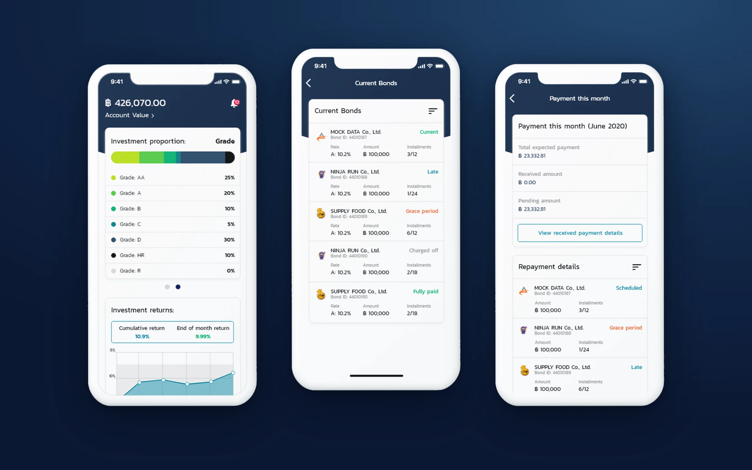
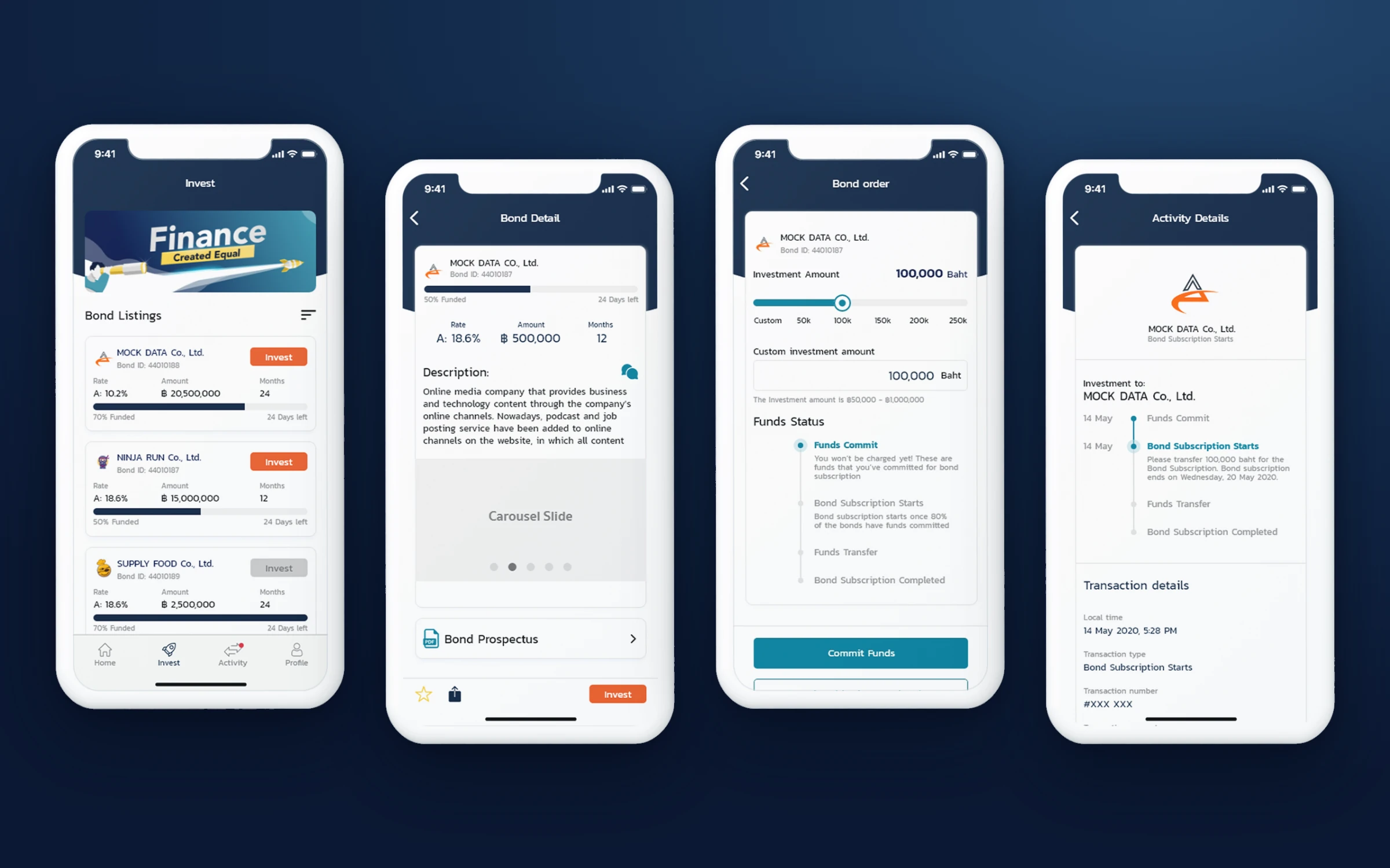
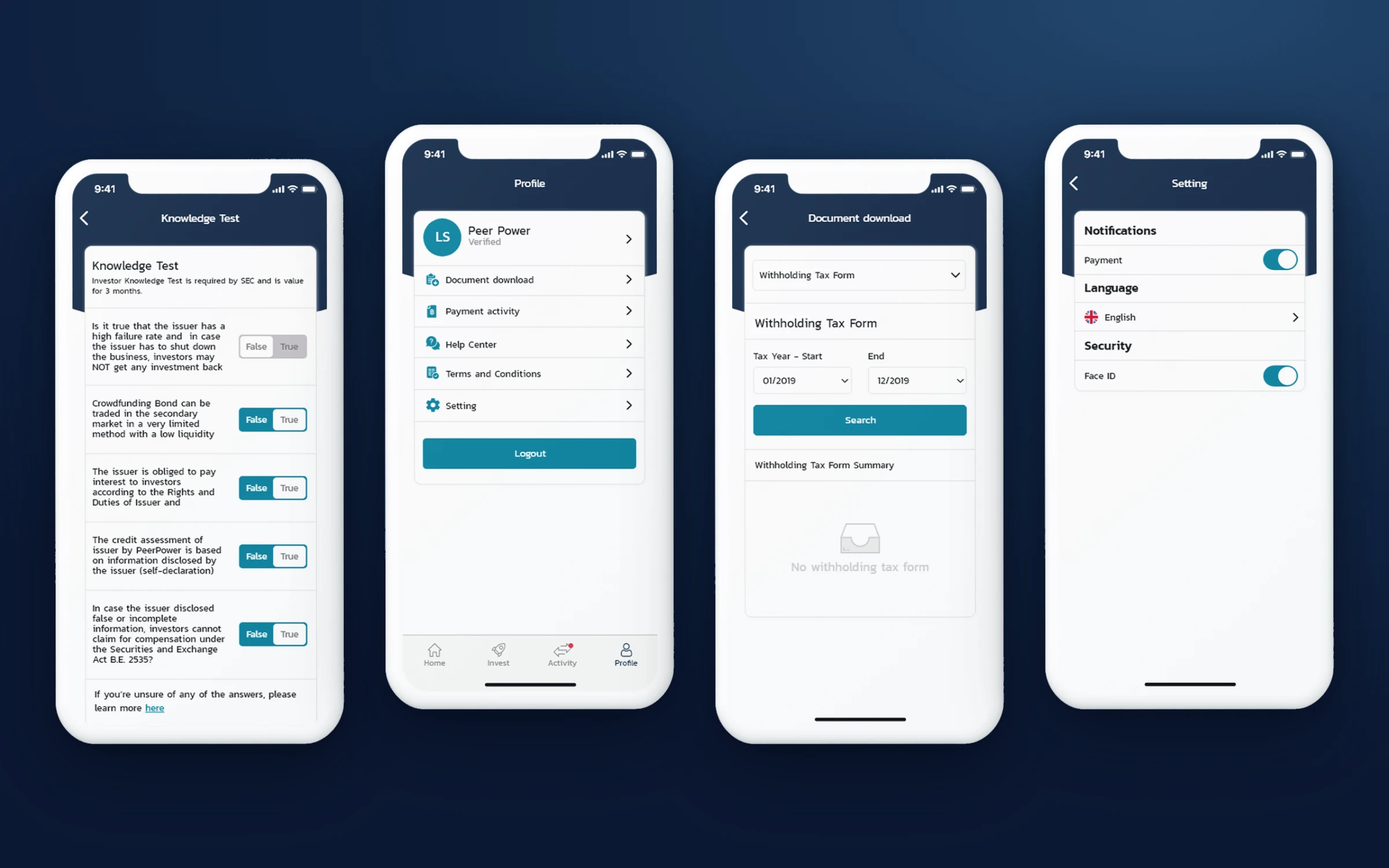
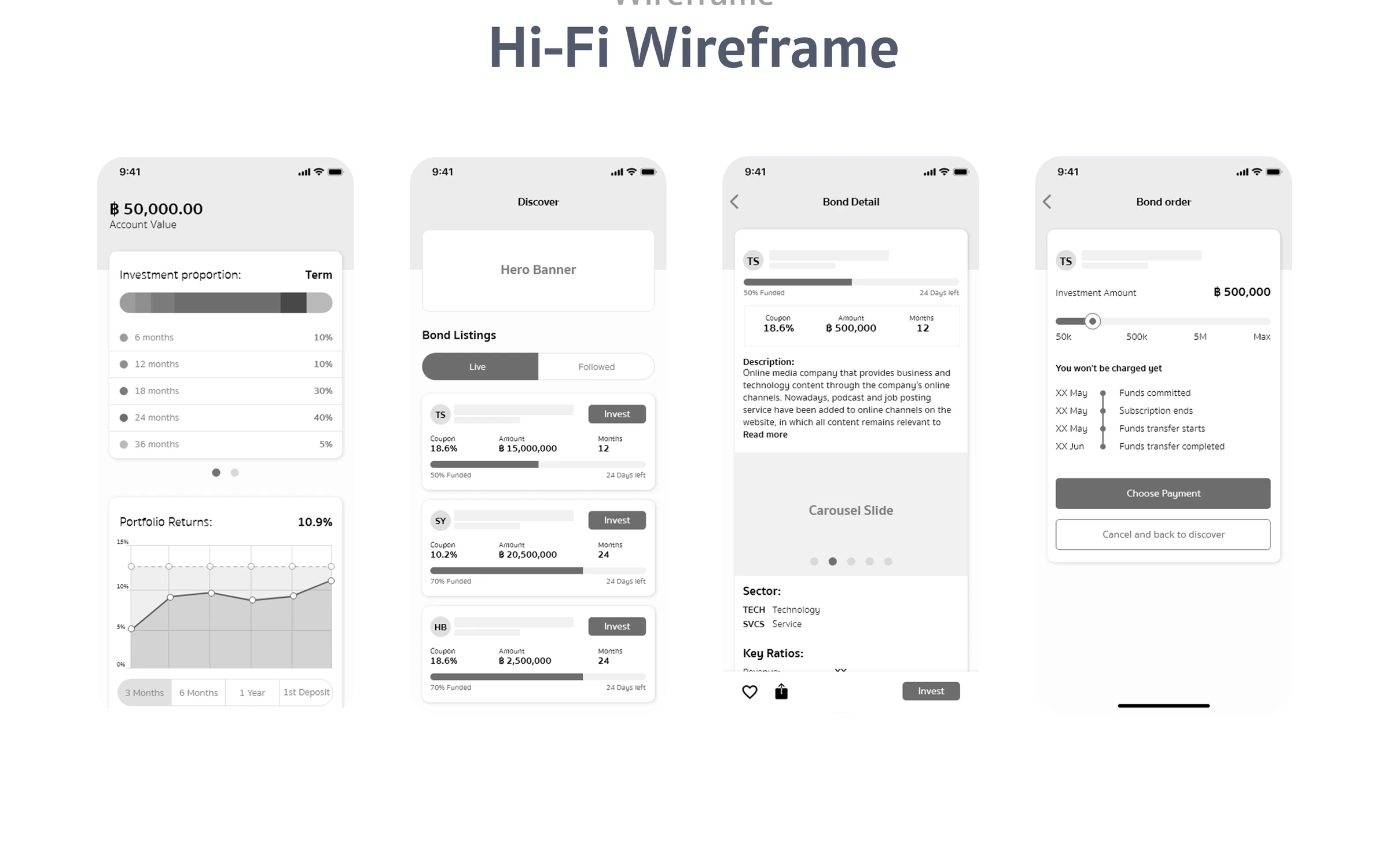
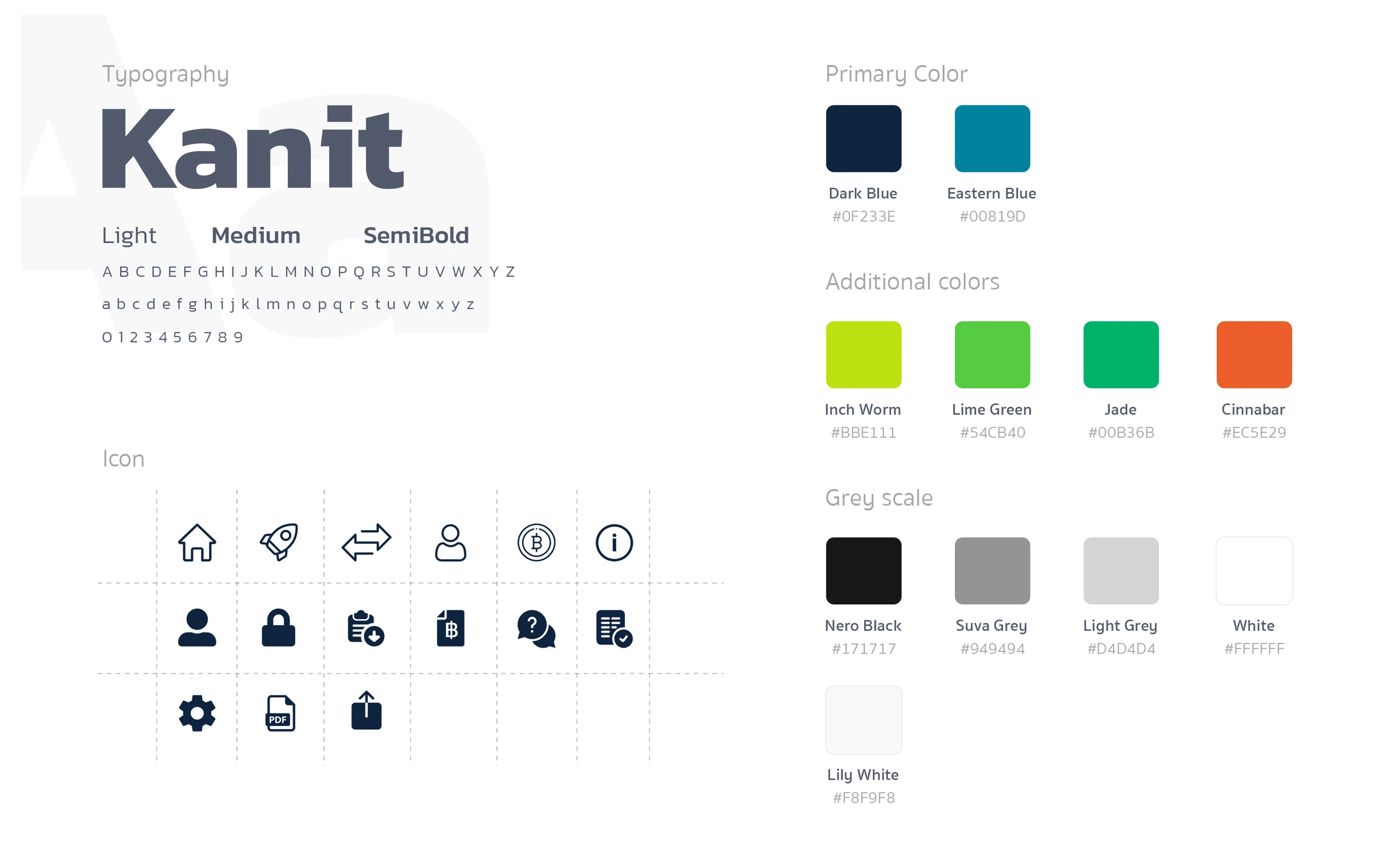
From there came the structure: Home, Marketplace into each bond and its order, Activity, and Profile with documents and settings. Then the flows, hi-fi wireframes, the visual design and a prototype. The app holds a lot of numbers, so everything sits on cards with clear proportions: portfolio split by grade, returns over time, a funds-status timeline on every order, and repayments labelled scheduled, late, grace period or fully paid. The SEC's investor knowledge test, withholding-tax documents and Face ID sign-in are part of the same system, set in Kanit on PeerPower's dark and eastern blue.
Role
UX research (user interviews, A/B tests)
UX/UI design
Prototyping